
November 4, 2004
Purple People
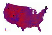 Hello, world. Check out this map of presidential votes cast by county before you imagine that America is mostly Jesusland. (Red is all Bush, Blue is all Kerry, and purple is in between.) And if someone, such as Dick Cheney, tells you that George W. Bush got the largest number of votes of any presidential candidate in history – which is true – you can tell them that John Kerry got the second largest number of votes in history, and that more people voted against an incumbent president than ever before in our country’s history. Yes, Bush was finally elected – but not by much.
Thanks to Robert Vanderbei at Princeton for generating the map. He’s one of many academics in many departments who have worked to help us understand the election.
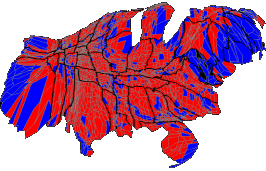 Update: As I mentioned in comments, maps make it seem as if land masses get to vote. A cartogram distorts the geography to make areas proportional to population. This one comes from this site, where a “purple” one is also available.
November 4th, 2004 at 7:24 pm
So, then, Dick Cheney’s claim of a clear mandate makes him a one-eyed one-horned lying purple people eater?
November 4th, 2004 at 9:52 pm
Nick, the world is watching and hurting.
Maybe you can reintroduce the idea of city states, autonomous islands of tolerant, scientific, creative, enlightened people within the sea of Jesusland? ;)
Check out this quote, from Shakespeare:
Beware the leader who bangs the drums of war in order to whip the citizenry into a patriotic fervor, for patriotism is indeed a double-edged sword. It both emboldens the blood, just as it narrows the mind …And when the drums of war have reached a fever pitch and the blood boils with hate and the mind has closed, the leader will have no need in seizing the rights of the citizenry. Rather, the citizenry, infused with fear and blinded with patriotism, will offer up all of their rights unto the leader, and gladly so. How do I know? For this is what I have done.
— Julius Caesar
http://socialarchitect.typepad.com/musings/2004/11/shakespeare_quo.html
November 5th, 2004 at 4:04 am
http://www.weeklystandard.com/Content/Public/Articles/000/000/002/820yqhap.asp?pg=1
November 5th, 2004 at 1:21 pm
55,949,407.
November 5th, 2004 at 2:38 pm
The “political capital” Bush now speaks of really comes down to some pocket change — barely enough to do laundry…
November 5th, 2004 at 3:25 pm
I can’t help but wonder how much the “we’re all purple” map is optical illusion. It’s very easy to swap blue and green on the map, and the result feels very different. If I had better graphics software, I’d try it with a blue/yellow/green mix.
November 5th, 2004 at 3:34 pm
It’s also oddly satisfying to run a “red eye reduction” filter on that map.
November 5th, 2004 at 4:50 pm
Jeff, the “purple” map is indeed an optical illusion of sorts, but it’s a less deceptive optical illusion, in some important ways, than are the “almost all red” maps, suggesting 100% support for Bush in some places and 100% support for Kerry elsewhere. Both maps are still deceptive because the president is not elected by land masses but by electoral votes, so that population and statehood are factors while geographic size is not one at all.
I believe Jane Smiley’s argument, that “The election results reflect the decision of the right wing to cultivate and exploit ignorance in the citizenry,” that “The error that progressives have consistently committed over the years is to underestimate the vitality of ignorance in America.” Bush fundamentally lied (most clearly, about why we should start a war) and we thought people could not possibly believe his lies; there was no reason to even bother to point out those lies, it was so obvious. We failed our fellow citizens, bandersnatch and others who believed the lies and who cowered in terror and supped on the flattery and deception of the Bush campaign, by not speaking to them, by leaving them with only those lies to listen to. Let’s not fail them again.
November 6th, 2004 at 5:50 pm
One answer to the “land masses don’t vote” problem is to produce a cartogram, in which regions are distorted so that their size is proportional to their population. A “purple” catrogram done by county is now available online.
November 7th, 2004 at 3:59 am
I don’t like the cartogram either: It’s misleading in a different way. There is a reason that the US does not use a strict majoritarian voting system for its presidential elections, and it’s certainly not an accident. Many theorists on representative government–the US’s founders among them–do not feel that we ought to be reduced to crass majoritarianism, where whichever group has the most members wins. Instead, we ought to balance various cultural and geographical groups and interests, not preferring one over the other simply because its members happen to make babies faster.
(Imagine, for example, a UN founded on majoritarian principles.)
November 7th, 2004 at 3:49 pm
Mark, I’m not sure what is misleading about the cartograms I linked to. They show how the population of the United States voted, which has been the topic of this thread from the beginning – hence “people” in the title and the starting point of the discussion being the popular vote.
Anyone following the election with real interest should know by now that it is the electoral college, not the popular vote, that determines who is elected president. The cartograms I linked to don’t argue against that, they just show how people voted, trying to make that clear in different ways. If you want a cartogram where the area of a state is proportional to its electoral college votes, here’s one.
November 9th, 2004 at 7:45 pm
Mark, I understand the anti-majoritarian argument. However, our current system has exactly that flaw. With a Republican house, senate and president (and a social conservative to boot), it feels like the 48% of us who didn’t vote for Bush are subject to the tyrany of the (bare) majority who did. In a parlimentary system we’d put together a coalition government – this would at least offer checks and balances to ideological extremes (on both ends).
November 12th, 2004 at 2:13 am
The luminosity map in Robert Vanderbei’s site seems to show that higher-density areas vote Democratic, while lower-density areas vote Republican. Perhaps the Democratic party could be accurately named the “Urban” party, with the Republican party named the “Rural” party. I’m a black Republican Detroiter who supported Bush, so I know that there are exceptions, but the general pattern is clear to me.
My impression about the campaign is that pointing out lies from Bush wouldn’t have changed many votes; many voters instictively support the U.S. military in whatever they do; they associated Kerry with “crazy” anti-war protesters, so they voted for Bush.
November 16th, 2004 at 12:06 pm
Essayist and interactive fiction author Adam Cadre has posted an extensive series of short essays worth a read called Election Shrapnel.